Spotify’s Smart Interface Finds Your Next Song—But Can Lose Your Place

Spotify’s best design decision is also its most persistent gamble: it tries to guess what you want before you ask. Open the app and a familiar artist, a playlist, or a half-finished listening session is often already within reach. That makes Spotify: Music and Podcasts feel unusually quick when its assumptions match your mood. When they do not, the same recommendation-heavy interface can make simple intentions harder to express. The app is less a tidy music shelf than a very capable host who keeps suggesting the next thing.
That distinction matters because Spotify is not merely a catalog with a play button. It is where people move between a saved album, a friend’s playlist, a podcast episode, and whatever the day’s algorithm has surfaced. Its interaction design succeeds when those transitions feel natural, and falters when the interface treats discovery as more important than orientation. The result is an app with excellent momentum and a library that can take effort to navigate.

Spotify: Music and Podcasts
Spotify AB4.3Music & Audio
See More Apps Related to Spotify: Music and Podcasts


Orientation starts with a guess
On first use, Spotify quickly establishes the basic promise: choose something familiar, browse what is popular, or let recommendations lead. The Home screen gives new listeners a way in without demanding that they understand the whole catalog. Large cover art, short labels, and personalized rows make the page scannable, especially on a small phone screen. If you have listened before, returning to a recent mix or album is usually faster than searching from scratch.
But Home is not a neutral welcome mat. Its order reflects Spotify’s confidence about your habits, and its rows can shift as listening changes. That makes the experience feel alive, though less predictable than a conventional collection. A first-time listener may understand what to tap but not why one playlist sits above another. Spotify supplies plenty of choices; it is less clear about the logic behind them.
The app’s early orientation works best when the listener has a rough intention rather than a precise destination. “Play something upbeat” fits its mood-led surfaces. “Find the exact live recording I saved last year” is a different job, and the opening screen does little to explain where that item lives. Spotify invites browsing before it teaches the shape of the library.
Navigation built around listening, not filing
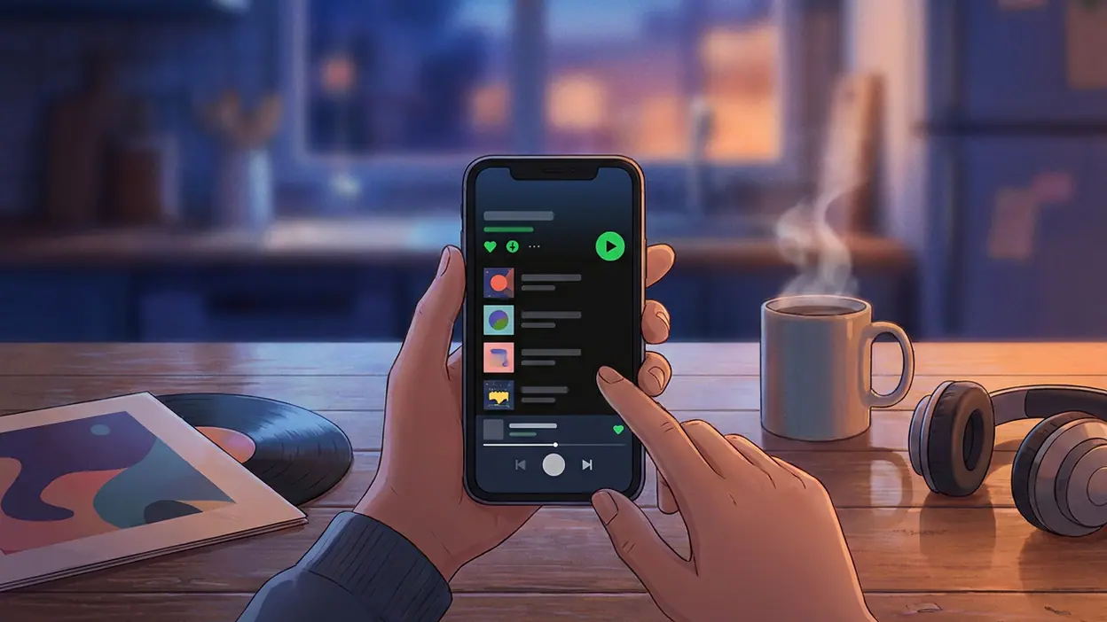
The bottom navigation keeps the main areas within thumb reach, while a persistent mini-player gives the current track a visible foothold as you move around. This is a strong hierarchy choice: playback is the ongoing task, so it should not disappear whenever you leave a playlist. Tapping the mini-player expands the listening view, where artwork, track details, and transport controls become the focus. The path from browsing back to the song is simple and easy to learn.
Home and Search serve different instincts. Home says, “Here are things you might like”; Search says, “Tell me what you came for.” That split is sensible, but the Home screen’s many shelves can blur into one long stream of recommendations. Search is often the cleaner route for a known artist or album, while the library is the more natural place for saved material. In practice, listeners learn these boundaries through repetition rather than through explicit guidance.
Worth Reading Next

OpenTable’s OS Update Makes Booking Smoother, but Search Still Leads

Cash App by Use Case: Who Should Trust It With Their Money?

Clash of Clans Makes Every Raid the Start of a New Plan

Stickman Warriors Is Built for Quick Fights, Not Deep Competition

Downloader’s One-Tap Promise Comes With Real Limits
More From Our News Desk
View All


The library is where Spotify’s generous breadth creates a navigational tax. Saved music, playlists, albums, podcasts, and other collections coexist, and filters or sorting controls help once you know what you are looking for. Yet a listener who thinks in terms of “my music” may find that the app’s distinctions do not always match their own. A saved album and a liked track are related in human memory; in the interface, they can lead to different routes. Google Play Books & Audiobooks, by contrast, is organized around a more stable idea of owned or chosen titles. Spotify’s collection is more fluid, but that flexibility asks users to remember how they saved something.
Spotify’s central hierarchy favors the next listen over the perfect filing system. That is a reasonable choice for an app people often open while walking, cooking, or getting ready. It is also why the library can feel like a secondary concern, even for listeners who have spent years building one.
Feedback that keeps the music moving
Spotify generally makes the result of a tap visible quickly. Selecting a track changes the mini-player, play and pause respond immediately, and moving into a playlist or album brings the relevant artwork forward. The expanded player gives the current choice a clear visual anchor, so it is easy to confirm what is playing without reading a dense screen. On a phone, that reassurance is not cosmetic: it prevents the small but common worry that a tap landed on the wrong item.
Actions such as saving, following, or adding something to a playlist provide useful feedback, though the meaning of each action is not always equally obvious. A filled icon can confirm that something was liked, but it does not necessarily tell you where to find it later. Adding a track to a playlist is more concrete because the action names a destination. The interface is strongest when feedback explains both what changed and where that change now belongs.
Playback itself has a clear hierarchy, but some controls ask for familiarity. Queue management, device selection, and track options are available from the listening view, yet they sit behind smaller icons or menus rather than competing with play and pause. That is mostly good restraint. A casual listener gets an uncluttered player; an experienced listener can reach the deeper controls once they know where to look.
Friction, wrong turns, and recovery
Spotify’s most persistent friction comes from the gap between discovery and retrieval. A recommendation can send you into a playlist, then to an artist page, then to an album, but returning to the thing you meant to save may require several back taps. Search can rescue the moment, although it is not always the best answer when you remember a cover or a playlist title only vaguely. The app rewards curiosity more readily than it supports retracing your steps.
There is also a difference between undoing an action and understanding it. If you start the wrong track, the player makes recovery easy: pause, skip, or choose another item. If you save something in the wrong place, correction can involve reopening menus and working out which collection changed. The cost is small, but repeated small costs make a personal library feel less dependable than it should.
Spotify’s interface offers enough familiar landmarks that mistakes rarely become dead ends. Home, Search, the library, and the persistent player remain available as practical escape routes. Still, the app could make recovery more legible by giving clearer confirmation after collection changes and by making recent browsing easier to retrace. Its design assumes that most detours are pleasant. Some are; others are simply detours.
Consistency, density, and the small screen
Across the app, dark surfaces, bright accent colors, and prominent cover art create a recognizable visual language. Playback controls remain familiar, and the mini-player ties browsing screens together. That consistency lowers the effort of moving between music and podcasts. Spotify: Music and Podcasts can feel like one continuous listening space rather than a set of unrelated sections, which is a real advantage for people who switch between an album and a show in the same session.
Consistency does not mean every screen has the same rhythm. Home is a stack of visual recommendations; Search is more task-oriented; the library is a working collection; and the player strips things back to the current audio. Those shifts make sense, but they also mean that the same kind of decision can appear in different visual contexts. A listener may browse podcast episodes much like music, yet the habits of saving, following, and resuming do not always feel identical.
On small screens, Spotify makes the right broad trade: large artwork and generous touch targets over dense rows of text. The mini-player preserves access to the current session, and the main navigation stays close to the thumb. The cost is vertical space. Home can require substantial scrolling before a desired section appears, and the screen’s visual abundance can make each item feel equally urgent. A weather app such as AccuWeather can prioritize a single practical answer at the top; Spotify has no one answer to privilege, so it uses personalized ordering instead.
That choice suits an app opened for companionship as much as for a specific task. It is less comfortable when the listener is in a hurry. Spotify’s screen design says, “There is always another good thing here,” while a focused interface would sometimes say, “You are exactly where you meant to be.”
What experienced listeners notice
Regular users become fluent in Spotify’s quiet shortcuts. They know that the mini-player is a bridge, not just a status strip; that Search is often faster than browsing; and that the library’s filters can turn a sprawling collection into something manageable. They also learn the practical difference between liking a track, saving an album, and following an artist. This knowledge makes the app feel nimble, but it is learned knowledge, not an obvious map offered upfront.
That learning curve is a design trade rather than a fatal flaw. Spotify has to serve someone who wants one familiar playlist and someone who manages years of listening history. A simpler interface could help the first person while frustrating the second. The app chooses layered controls and personalized surfaces, trusting frequent listeners to build their own mental shortcuts. That is effective for long-term use, but less welcoming when your memory of the app is rusty.
The contrast with Trivia Crack: Brain Quiz Games is useful here. A quiz game typically makes the next action explicit: answer, score, continue. Spotify’s next action is deliberately open-ended. You might keep listening, browse, save, or switch genres. Its ambiguity creates room for discovery, but also means users must supply more of the structure themselves.
The strongest design choice
Spotify’s most successful interaction is the continuity between browsing and playback. The mini-player keeps the current session present without taking over the screen, and the expanded player offers a clear place to control it. This is a modest piece of interface design with outsized value. You can leave a playlist to search for something else, inspect an artist, or move through your library without losing the thread of what is already playing.
That continuity gives Spotify its everyday stickiness. The app does not make each listening choice feel like a separate transaction. It supports a session that can wander: one album leads to an artist, an artist leads to a playlist, and the playlist keeps the music moving while you decide what comes next. The system is at its best when its recommendations feel like invitations rather than interruptions.
For all its crowded surfaces, Spotify understands that people usually open a music app to hear something, not to admire its organization. It keeps the act of listening close at hand and lets browsing happen around it. That priority is why the interface remains usable despite the sheer variety of content.
A design verdict with a caveat
Spotify’s mobile design is confident, responsive, and built for habitual use. It orients newcomers with familiar recommendations, keeps playback within reach, and makes moving between discovery and listening feel natural. Its weaknesses come from the same philosophy: Home can be noisy, personal collections can be hard to retrace, and some useful habits have to be learned rather than shown. The app is better at helping you find something to play than helping you account for everything you have kept.
I would call Spotify a compelling listener’s interface, not an especially clear library interface. That is a defensible priority for a service built around momentum, and the persistent player is the clearest proof that the designers understand their audience. But the next improvement should not be another recommendation row. It should make saved things easier to find, explain collection changes more plainly, and give listeners a better way back from a browsing detour. Spotify already knows how to keep the music going; its next design challenge is helping people feel equally in control of where they are.