Sephora’s Beauty Finder Narrows the Choices, but It Can’t Know Your Skin

Buying foundation online is a small gamble dressed up as a routine purchase. A shade can look right in a product photo and wrong on your face; a moisturizer can sound ideal until it clashes with what you already use. The most valuable feature in Sephora: Buy Makeup & Skincare is its attempt to make that uncertainty manageable through guided product discovery, especially shade matching and tailored recommendations. It cannot replace trying something on, but it can make the first shortlist less random.
That distinction matters. Sephora’s app is also a large storefront, packed with brands, launches, reviews, offers, and account features. The useful question is not whether it has plenty to browse. It does. The question is whether its discovery tools help you move from “I need something” to a considered choice without turning shopping into an endless scroll. In my view, they do their best work as a filter, not as an oracle.

Sephora: Buy Makeup & Skincare
Sephora USA, Inc.3.9Beauty
See More Apps Related to Sephora: Buy Makeup & Skincare


A filter for the hardest beauty purchase
What the feature actually does
Sephora brings product recommendations and beauty tools into the same shopping journey. Depending on the current app version, device, and market, shoppers may encounter features such as shade-finding guidance, virtual try-on, quizzes, and product suggestions shaped by preferences or past activity. These tools are not identical, and availability can change, but they share a purpose: use a little information about the shopper to narrow a very large catalog.
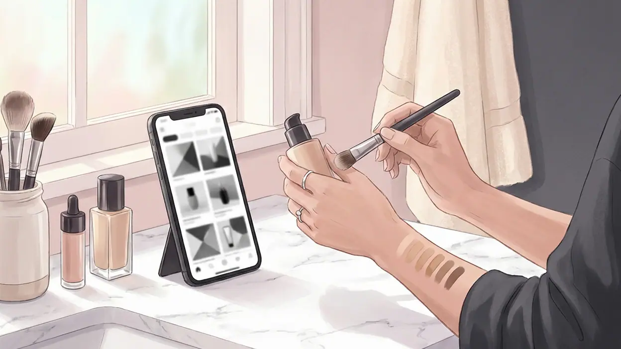
Shade discovery is the clearest example. Rather than starting with every foundation in the store, you can look for a likely match using a known product or a guided selection process. Virtual try-on can add another clue by placing a digital shade on a live camera view. Product pages then let you check the details that a recommendation cannot settle by itself: finish, coverage, ingredients, customer feedback, and price.
The important part is the handoff. A tool that suggests a match is only useful if it gets you to a product page where you can judge the suggestion. Sephora generally keeps that path close at hand: browse, inspect, compare, and add to a basket without starting over in a separate service. Less searching, more informed comparison is the real promise here.
Why a small shortcut matters
Beauty shopping has an unusually high cost of being almost right. A lipstick that is a little brighter than expected may still be fun; a complexion product that is visibly off can sit unused in a drawer. Skincare adds a different kind of uncertainty: two products with similar claims may behave differently on sensitive, oily, or dry skin. A broad store search can surface plenty of options, but abundance alone does not help someone decide.
That is why a recommendation tool can matter more than its modest interface suggests. It gives shoppers a starting point and a reason to compare a few candidates instead of opening dozens of tabs. Reviews and product information can then answer the next questions: whether the finish looks natural, whether a formula tends to feel rich, or whether customers with similar needs report a good experience. None of this guarantees a perfect pick, but it makes the decision more legible.
Worth Reading Next

Google Maps Go Review: Quick to Orient, Harder to Recover

F-Secure Mobile Security Makes Everyday Phone Protection Practical
More From Our News Desk
View All


There is also a practical benefit for people who already know a product they like. A familiar shade or formula can serve as an anchor when they want to try another brand or restock from a different category. Instead of beginning with brand names and marketing language, they can begin with a reference point they understand. That is a more useful way to shop than simply letting the newest launch dominate the screen.
Where it earns its place
The best real-world scenario is a restock with one deliberate change. Imagine you have run low on a complexion product and want similar coverage in a different finish, or a moisturizer that feels lighter for warmer weather. You can use the app to find the familiar item, inspect its details, then compare nearby alternatives and read reviews before buying. The discovery layer helps keep the search focused while the catalog gives you room to make a choice.
It is less persuasive as a substitute for a proper in-person test when the stakes are high. A camera preview is affected by lighting, screen color, and how the phone reads your face. Even a good shade suggestion cannot fully account for undertone, oxidation, or the way a formula settles after an hour. For a first foundation purchase, I would treat the app’s result as a shortlist, then use samples or a store visit if that option is practical.
That qualified use is not a failure. It is a realistic division of labor. The app can help you decide what deserves attention; your own skin, preferences, and experience make the final call. Used that way, the feature saves time without asking the shopper to trust a screen more than their own judgment.
How it changes the shopping habit
Good discovery tools change behavior by reducing the pressure to browse everything. Instead of scrolling until a product looks familiar, you can start with a need, narrow the field, and compare a handful of plausible options. That shift is subtle but valuable: it replaces passive exposure to more products with a clearer decision process.
It can also make repeat shopping less mechanical. A returning customer may have a purchase history, saved items, or a remembered preference to build on, while someone new can use categories and guidance to get oriented. The app still has commercial reasons to show new products and promotions, so recommendations should not be mistaken for neutral expert advice. But the shopper has more context than a bare search box provides.
There is a limit to how personal the experience feels. A quiz or filter can sort stated preferences; it cannot reliably understand every routine, sensitivity, or aesthetic. Recommendations can be helpful without being intimate. Sephora’s strongest approach is therefore the one that leaves room for the shopper to inspect the evidence rather than presenting a match as a verdict.
Design that supports comparison
The app’s smartest design choice is keeping discovery close to shopping. A virtual preview or recommendation would be a novelty if it led nowhere, but linking the result to product details gives it a job. The shopper can move from a possible shade to reviews, ingredients, and purchase options in one connected flow. That continuity matters more than visual polish alone.
The wider store also gives the feature useful context. Sephora sells across makeup, skincare, haircare, and fragrance, with products from many brands. That breadth can be intimidating, but it makes comparison meaningful when the app helps narrow the field first. Reviews add the texture that product descriptions often lack, though they are still personal accounts rather than controlled tests. The design works best when all those sources inform one decision, not when any single badge or score is treated as proof.
My reservation is that a large retail app can feel busy even when its tools are useful. Promotions, new arrivals, editorial content, and personalized suggestions all compete for attention. If you arrive with a clear task, the store is manageable; if you are already unsure what you want, the amount of choice can quickly bring back the very problem the discovery feature is meant to solve.
Where it still falls short
Digital shade matching has a hard ceiling. Camera lighting changes from room to room, phone displays vary, and a virtual overlay cannot show how makeup moves on textured skin or looks in daylight. Results should be treated as guidance, not a promise. That caution is especially important for shoppers who are new to complexion products or whose shade is difficult to place through a limited set of options.
Recommendations have a similar weakness: they can narrow choices, but they may not explain enough about why one product suits you better than another. The shopper still has to read labels, compare formulas, and judge trade-offs. Skincare is particularly resistant to a quick answer because skin can react unpredictably, and an attractive claim does not establish that a product will work for a particular person.
There is also the ordinary friction of shopping on a phone. Product pages contain a lot to assess, and the broader experience may invite more browsing than a focused task requires. A tool that begins as a shortcut can become another doorway into the catalog. The best remedy is to arrive with a specific need and use recommendations to create a shortlist, rather than expecting the app to decide what you should buy.
How other apps solve a different problem
Most apps are not direct rivals for this kind of decision. Kahoot! turns questions into a social quiz; Dune: Imperium Digital adapts a strategy game; Phone to TV HDMI USB-C MHL is built around connecting devices; and Tackle Football Playmaker X focuses on drawing and planning plays. Their goals are different, so they are useful mainly as a contrast: each is organized around a clear task. Sephora has a harder design challenge because shopping combines search, persuasion, personal taste, and uncertainty in one place.
That challenge makes the discovery feature more valuable, but also makes it easier to dilute. A quiz app can tell you when a round is over. A beauty retailer cannot produce the same clean finish, because preference and fit are subjective. Sephora’s tool is most credible when it helps you compare evidence and least credible when it suggests that a camera preview can settle a nuanced question on its own.
Who gets the most from it
The feature is most useful for regular Sephora shoppers who know what they like but want help exploring an adjacent product, shade, or formula. It also suits people who prefer to research before visiting a store, and anyone trying to cut a sprawling catalog down to a manageable set. For those shoppers, the app can turn a vague browsing session into a more deliberate shortlist.
It is less essential for someone who already has a trusted routine and buys the same items repeatedly, though the store remains convenient for reordering. And anyone expecting a digital tool to diagnose skin concerns or guarantee an exact complexion match should keep their expectations modest. The app is a shopping assistant, not a dermatologist, makeup artist, or substitute for testing.
At its best, Sephora: Buy Makeup & Skincare makes a crowded beauty store easier to navigate without pretending that beauty choices can be reduced to a perfect algorithm. Its product-discovery tools are genuinely useful when they shorten the path to a sensible shortlist, especially for comparing shades and exploring familiar preferences. They remain imperfect, and the app’s commercial setting can make focused shopping feel busy, but the underlying idea is sound: use digital guidance to get closer to the right product, then let real-world judgment finish the job. That is a practical feature, not magic, and it is exactly why it works.