Google Maps Go Review: Quick to Orient, Harder to Recover

Google Maps Go is built around a useful contradiction: it looks like a map you already know, yet it asks you to accept that some of the familiar map experience is somewhere else. That bargain can make a low-powered phone feel nimble, especially when the task is simply to find a place or check a route. But the design is not just a smaller version of Google Maps. It is a thinner interface with thinner feedback, and the gap matters most when a journey stops being straightforward.
Its central design achievement is reducing the weight of getting oriented. Its central weakness is that, once a user wants to do more than look and go, the interface does not always make clear what it can do, what it has handed off, or how to get back. I found it most convincing in brief, purposeful visits: search, scan the result, decide whether to head there. It is less persuasive as a companion for the messy middle of travel.

Google Maps Go
Google LLC4.1Travel & Local
See More Apps Related to Google Maps Go


A map designed for the first decision
First-use orientation
The opening view gets the basic relationship right. A map occupies the screen, a search field sits where a thumb and eye can find it, and the familiar Google palette gives the scene an immediate sense of place. There is little ceremony before the user can ask a question. That restraint is a genuine design choice: Maps Go does not make people learn a new visual language before they can search for a station, shop, or street.
But visual familiarity also sets expectations. A user arriving from the full Google Maps app may assume that every visible place can be explored with the same depth, or that every familiar control will lead to the same kind of interaction. The first-use experience does not do much to explain the boundaries. It shows a simpler map, rather than clearly framing itself as a simpler map product. That keeps the interface uncluttered, but it leaves discovery to trial and error.
In practice, the first useful moment is strong: enter a destination and the app quickly turns a vague intention into a result. The less satisfying moment comes after that. Some tasks route through a browser or another Google service instead of continuing inside the map. Those transitions may be necessary to keep the app light, but they can feel like a change of room without a sign on the door.
Navigation and hierarchy
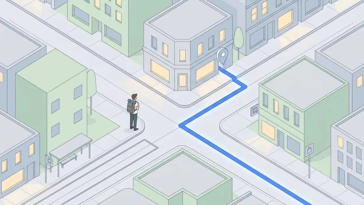
The hierarchy is at its best when the user has one clear question. Search takes priority, results are presented as recognizable places, and the map remains the spatial reference rather than becoming a decorative backdrop. This makes the app easy to skim while walking or while making a quick plan at a desk. It does not bury the core job beneath layers of cards and recommendations.
That same hierarchy can become too flat once a result is selected. Name, location, and route intent are all important, but the interface offers less help in distinguishing what deserves attention next. In a richer map app, place details, saved information, reviews, and other context can compete for the eye; Maps Go avoids much of that competition. The trade-off is that a user may see the destination without receiving enough context to judge it. The screen answers “where?” more readily than “is this the right place?”
Worth Reading Next

Netflix Builds Shared Viewing Habits but Leaves Community to the Internet

F-Secure Mobile Security Makes Everyday Phone Protection Practical
More From Our News Desk
View All


Route choice also exposes the difference between a map and a navigation system. The app can help a user orient toward a journey, but the sense of a continuous, richly managed trip is not as strong as it is in the full Google Maps experience. For a simple point-to-point plan, that can be enough. For a route that involves changing modes, checking alternatives, or adapting on the move, the thinner hierarchy makes the user do more of the organizing.
Feedback after actions
Maps Go generally gives quick visual confirmation that a search has worked: the view changes, a result appears, or the map recenters. These responses are valuable because mapping is a high-consequence interface in small ways. A user needs to know whether a tap selected the intended place or whether the map simply shifted beneath a finger. The app’s familiar visual conventions help, and the speed of those changes supports its lightweight purpose.
Still, speed is not the same as clarity. When an action opens a browser-based page or another Google surface, the feedback can feel less like a deliberate next step and more like an interruption. The user has to infer whether the destination is part of Maps Go, whether the original map is still available, and how to return without losing the thread. A brief transition cue or a more explicit back-to-map route would make these handoffs feel intentional rather than incidental.
This is where the product’s design thesis gets tested. A lean app should not need to imitate every feature of a larger one, but it should make its limits legible. Maps Go is often responsive enough to feel competent; it is less consistent at explaining the consequences of an action.
Friction and recovery
Recovery is the part of navigation design people notice only after something goes wrong. I searched for a place with a similar name to my intended destination, then had to rely on the result details and map position to catch the mismatch. That is a reasonable check in any map app, but a compact experience needs especially clear cues: the exact address, the surrounding street pattern, and a simple way to return to the result list. Maps Go gives the user a map to inspect, but it does not always make the correction path feel as direct as the initial search.
Touch gestures add another small source of friction. Pinching and dragging are familiar, but on a cramped screen it is easy to move the map when intending to select a location, or to lose the visual anchor that made the destination recognizable. Recovery then means rebuilding context by zooming, searching again, or retracing a previous screen. These are not dramatic failures; they are the small costs that accumulate when a person is already outside, in a hurry, or working with one hand.
The app’s lean approach also means fewer places to look for help when a task falls outside the simple search-and-orient pattern. The user is not overwhelmed by options, which is a win, but neither is there always a clear escape hatch. A good minimal interface removes clutter while preserving a route back. Maps Go is more successful at the first half of that principle.
Consistency across the experience
At a glance, consistency is one of the app’s strengths. The map colors, place markers, search behavior, and general Google visual language make the experience recognizable. Someone who has used Google Maps can begin without translating a new set of symbols. That continuity matters for a tool people may open only briefly and under pressure.
Consistency becomes more fragile at the edges, particularly when the app delegates a task to another surface. A place may start as a compact result, expand into a different page, and leave the user to reconstruct the relationship between that page and the map. It is not enough for each screen to look individually familiar; the transitions between them must preserve a sense of one journey. Here, the product can feel assembled from neighboring services rather than shaped as one continuous interaction.
That contrast is useful when comparing Google products. Google Home is organized around controlling connected devices, while Google Classroom is built around structured schoolwork. Each makes its main context visible. Maps Go has a more difficult job because a map is both an answer and a workspace, but it could still signal more clearly when it is showing a destination, preparing a route, or handing the user off.
Small-screen decisions
The compact layout is not merely a technical compromise. It forces sensible priorities. Search remains prominent, the map gets room to breathe, and there are fewer competing panels to cover the streets a user is trying to understand. On a modest phone, that can make a meaningful difference: the interface feels like a tool rather than a stack of windows.
There is, however, a limit to how much simplification a small screen can absorb. Reducing the number of visible controls can reduce confusion, but it can also hide the very action a user needs at that moment. The challenge is not to show everything; it is to expose the next likely action without making people guess. Maps Go often handles the first screen well, then becomes less generous as the user moves into details or tries to recover from a wrong turn in the interface.
Its best small-screen decision is keeping the map itself central. Its weakest is treating reduced surface area as a reason to reduce guidance as well. A little more contextual labeling could improve confidence without turning the app into the heavier product it is trying not to be.
What experienced users notice
For an experienced map user, the key question is not whether the interface is familiar. It is whether the lighter version preserves the habits that make mapping dependable. Can I compare a place with its surroundings? Can I tell whether a route is ready or merely suggested? Can I get back to the same view after checking a detail? Maps Go handles quick orientation better than these deeper continuity checks.
That makes it a useful secondary tool for a particular kind of user: someone with a low-end device, limited data, or a need for a quick location lookup rather than a full travel-planning session. It is less compelling for someone who has built a routine around saved places, layered research, and continuous navigation. A product can be deliberately narrow, but it should help expert users recognize where that narrowness begins. Maps Go mostly leaves them to learn the boundary by bumping into it.
The strongest design choice is the decision to keep the map, not the interface chrome, at the center of the experience. It sounds obvious, but many mobile products let menus and cards take over the screen. Here, search and geography remain in close conversation. A destination is not just a row to tap; it has a visible position in the world. That relationship is the most convincing reason to use Google Maps Go when all you need is a fast answer to “where is it?”
A clear but limited verdict
Google Maps Go is a focused design exercise in making orientation feel light. It is quick to enter, easy to recognize, and good at the first decisions of a journey. It respects the small screen by leaving space for the map, and it avoids the visual noise that can make a straightforward lookup feel like administrative work.
Its weaknesses appear when the user needs continuity: more context about a place, a clearer account of what happens after a tap, or a reliable route back after an accidental move. Those are not reasons to dismiss the app; they define the conditions under which it works best. I would reach for it to check a destination or get a quick sense of direction, but not as my first choice for a complicated day of changing plans.
The final design verdict is simple: Maps Go understands the value of a clear map better than it understands the value of a clear recovery path. Its restraint is useful, not elegant for its own sake, and that makes the app worthwhile. But a truly confident lightweight map would make its handoffs and limits as easy to read as its streets.