Cut and Paste Photo Editor Makes Quick Photo Composites Easy to Share

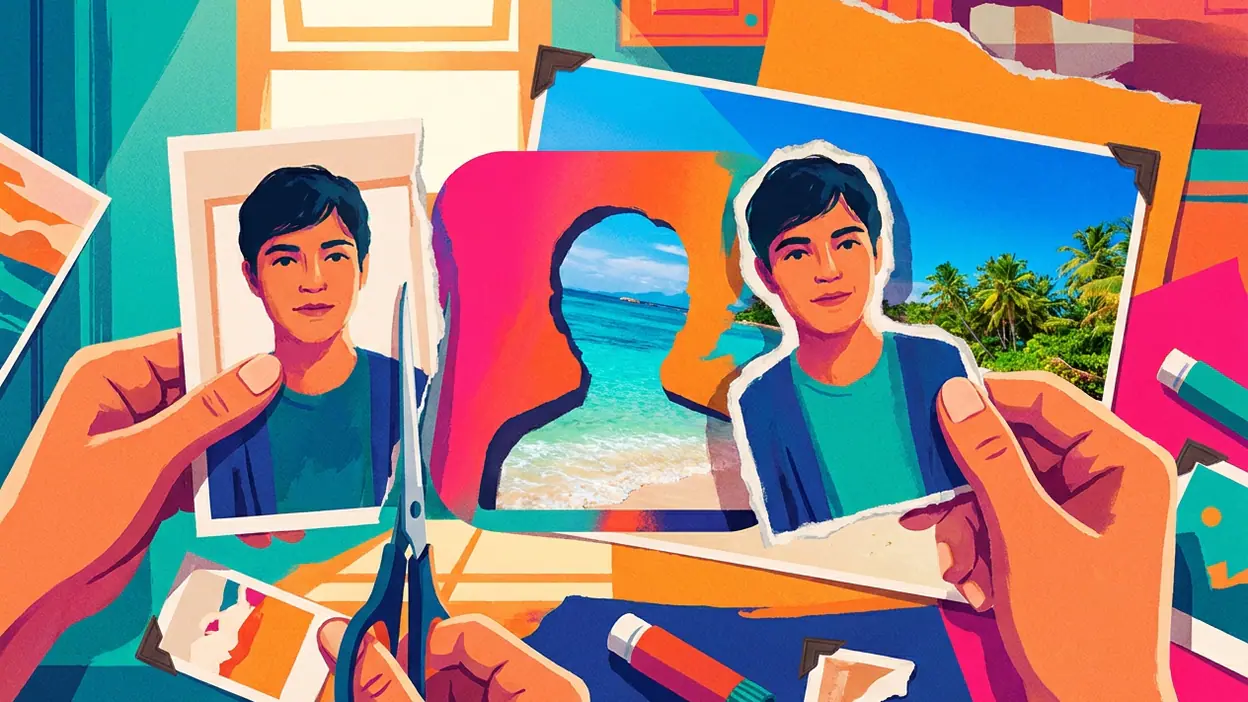
Most photo editors ask you to improve a picture. Cut and Paste Photo Editor asks a more entertaining question: what if the person in this photo were somewhere else? That shift from correction to invention is its central advantage. It turns an ordinary portrait into a small visual stunt, and its appeal rests less on professional polish than on how quickly it gets users from idea to shareable result.
That distinction explains both the app’s reach and its limits. It is not a full studio, and it does not need to be. Its strongest promise is a short, satisfying sequence: choose a subject, remove or isolate it, place it into another image, then see whether the gag, fantasy, or social post works. The loop is accessible enough to repeat, even when the final composite still needs a little patience.

Cut and Paste Photo Editor
Daily Joy Studio4.4Photography
See More Apps Related to Cut and Paste Photo Editor


Why a simple edit becomes a habit
The premise travels well because nearly everyone understands it without instruction. A friend can appear on a beach, a pet can take over a family portrait, or a selfie can become a deliberately absurd scene. The result is legible at a glance, which matters in group chats and social feeds where a picture has only a moment to land. Users do not need to learn layers, masks, or a design vocabulary before making something amusing.
Its real product is the before-and-after reveal. The source image supplies recognition; the pasted subject supplies surprise. That contrast gives even a rough edit a clear payoff. More elaborate photography tools may produce better portraits or more sophisticated effects, but they often require a different mindset. Airbrush: Face & Photo Editor is oriented toward refining a person’s appearance, while PREQUEL AI Filter Photo Editor leans toward stylized treatments. Cut-and-paste editing begins with a simpler creative impulse: put this here and see what happens.
The format also makes the app easy to recommend. Someone who has seen a funny composite does not need to be sold on an abstract feature list. They can imagine their own version immediately. That kind of social legibility helps a modest utility travel beyond people who consider themselves photo editors.
The task it handles better than a general editor
A focused cutout workflow reduces the distance between intention and action. General editors tend to present a broad toolbox: exposure, color, retouching, filters, cropping, and sometimes layers. That flexibility is useful, but it can also turn a casual experiment into a search for the right control. Here, the creative job is narrower. The user arrives with a subject and a destination, and the app’s value is making that transfer feel approachable.
It is important not to confuse approachable with flawless. Cutting a person out of a photograph is genuinely difficult when hair, motion blur, shadows, or a busy background complicate the edge. A clean silhouette can make a composite feel convincing; a halo or a jagged boundary can make the trick obvious. The app’s appeal is that it invites people to attempt the edit without requiring specialist knowledge, not that every selection becomes studio-grade.
Worth Reading Next

Asphalt 8 Turns Speed into a Daily Mobile Ritual

Amazon Kindle: Reading App - Where Books and Notes Go
More From Our News Desk
View All

That is a meaningful difference from Canon Camera Connect, which helps move images between a camera and a mobile device rather than turning them into playful composites. The two apps serve different stages of photography. One supports capture and transfer; the other makes an existing image available for a bit of visual mischief. Comparing them highlights how sharply defined this app’s job is.
Where the stickiness comes from
The design feels sticky because the first result rarely closes the idea down. It tends to open another possibility. A cutout that looks funny against one background may look more convincing against another. A user may try a second portrait, swap the destination, or redo the outline after noticing an awkward edge. This is a forgiving creative loop: a failed attempt is usually not a loss, just a reason to try a different source or scene.
There is also a natural escalation from private play to sharing. At first, the edit may be a test made for the person creating it. Once it works, it becomes a message, a reaction image, or a post. The app does not need to keep users inside a complex project for hours. A few minutes can produce a finished object with a clear audience outside the app, and that external payoff can bring people back the next time a suitable photo appears.
The habit is therefore situational rather than strictly daily. People may not open it every morning, but they can remember it when a birthday, group joke, holiday photo, or new selfie gives them material. That is a different kind of retention from a feed or a camera app that claims a place in every day. The app stays useful by being easy to recall at the right moment.
Its repeat-open strength depends on lowering the cost of experimentation. Users forgive some roughness if the central action is quick and the result is funny or expressive. They are less forgiving when the selection takes too long, the compositing controls feel fiddly, or the finished image looks unfinished in a way that distracts from the joke. In other words, the app earns patience only when it keeps the creative payoff in view.
What people forgive, and what they do not
Casual creators often accept imperfect edges, especially when the edit is deliberately comic. A slightly awkward cutout can even contribute to a homemade, meme-like feel. But that tolerance has a boundary. If the subject appears to float, if its lighting clashes sharply with the background, or if its scale makes no sense, the image stops reading as a playful composition and starts reading as a failed one.
That is where the app’s narrow focus becomes a constraint. A strong composite involves more than separating foreground from background. It may need feathering, shadows, color matching, perspective adjustments, and careful placement. Users who want those controls may outgrow the quick-edit approach and turn to a more comprehensive editor. A specialist tool can make the first attempt easy, but it cannot erase the underlying craft of convincing image assembly.
There is another trade-off in a mobile-first workflow: touch screens make moving and resizing a subject intuitive, but they can make precise edge work harder than a mouse or stylus-based desktop setup. Small adjustments require care, and a result that looks acceptable on a phone may reveal its flaws when enlarged. That is not a reason to dismiss the app; it is a reason to understand the kind of finish it is designed to deliver.
Who gets the most from it
The best fit is someone who wants a quick creative tool, not a replacement for every other photo app. Social users, casual meme-makers, parents making playful family images, and anyone who enjoys visual surprises can get value from the direct workflow. It is especially well suited to people who would rather try an idea than read a tutorial before starting.
It is less compelling for photographers whose priority is accurate color, detailed retouching, or a controlled production process. It also may not satisfy creators who want highly refined composites with fine masking and extensive light correction. SelfyzAI+ and PREQUEL can appeal to users looking for AI-driven transformations or conspicuous styles; this app’s identity is more grounded in the hands-on act of moving a subject into a new setting.
That contrast helps explain why competitors can appear stronger on feature lists without displacing it in its own lane. A larger editor can do more, but breadth does not automatically make a simple task faster. A camera companion can manage a better source image, but it is not built around remixing that image. A filter app can transform the mood in one tap, but it does not offer the same basic pleasure of relocating a familiar subject.
Can this kind of dominance last?
Its staying power depends on remaining the easiest answer to a recognizable creative impulse. The underlying idea is durable: people like seeing themselves, friends, and pets in unexpected places. It does not rely on a temporary aesthetic or a single social platform. As long as users keep taking photos and sharing jokes, cut-and-paste editing will have a reason to exist.
But the category is easy to imitate. Many editors can add a cutout feature, and improvements in automatic subject selection can make the basic action less distinctive over time. The app cannot rely on the novelty of removing a background forever. It has to keep the workflow dependable, make common adjustments feel manageable, and avoid burying the simple task beneath distractions. If it does that, its specialization remains an advantage. If rivals make the same edit cleaner and just as quickly, familiarity alone will not protect it.
Cut and Paste Photo Editor succeeds because it treats editing as play before it treats it as craft. Its best moments come from a fast, recognizable transformation and the urge to try one more version. Its weaknesses show when users expect seamless edges or professional compositing without the work those results require. I would recommend it to anyone who wants to make a photo more surprising, not to anyone looking for a complete photography studio. The app’s strongest claim is modest but persuasive: it makes a familiar image feel newly usable, and that is enough to bring people back.