WEBTOON Makes Reading Effortless, but Finding the Right Comic Takes Work

WEBTOON’s smartest design decision is also its easiest to overlook: it makes reading feel like one continuous gesture, then builds a whole discovery system around getting you to make that gesture again. The result is an app that rarely interrupts a story once it starts, but can feel less sure-footed when you are trying to find the right story, understand what is free, or recover a series you meant to save. That tension defines WEBTOON: Manga, Comics, Manhwa: a confident reading surface attached to a crowded, sometimes opaque storefront.
I came away appreciating the distinction. WEBTOON is not simply a shelf of comics with a reader bolted on. Its design has to move people between browsing, serialized reading, subscriptions, episode access, and community cues without making each transition feel like paperwork. It succeeds most clearly in the act of reading; elsewhere, its hierarchy asks the reader to learn by poking around.

WEBTOON: Manga, Comics, Manhwa
NAVER WEBTOON4.6Comics
See More Apps Related to WEBTOON: Manga, Comics, Manhwa


The experience, from first tap to last panel
First-use orientation: a feed before a map
On first opening the app, you land in a stream of featured series and recommendations rather than a short explanation of how WEBTOON works. That is a sensible bet: a comic is more persuasive than a tutorial about comics. Cover art, titles, and brief descriptions give you enough to start browsing, and a promising thumbnail can turn an empty account into an active reading habit in seconds.
But the feed explains the app’s content more readily than its rules. A newcomer may not immediately know which series update on a schedule, how episode access differs between titles, or what a login changes. Those details tend to make sense once you reach a series page or tap into an episode, but that is orientation by exploration, not by clear signposting. WEBTOON trusts curiosity to carry the onboarding load. For many readers, that will work; for anyone who wants to understand the arrangement before committing, the first screen is a lively invitation with a small-print feeling just beyond it.
Navigation and hierarchy: browse, then read
The app’s main navigation separates broad destinations, while the home feed does the more complicated work of presenting featured picks, popular titles, and recommendations. That split is useful in principle: the bottom-level destinations provide a stable way out, and the feed can keep changing without forcing the whole app to be relearned. In practice, the experience feels strongest when you already know whether you want to explore or return to something familiar.
Discovery can be visually persuasive but structurally dense. Rows and cards compete for attention, and a cover often communicates mood before the interface communicates format, access, or update status. I found myself judging a series by its artwork, then looking for the practical details once I was interested. That order is good for browsing and weaker for comparison. If you have a specific genre in mind, filters and category paths help; if you are simply trying to understand why one title is being pushed ahead of another, the recommendation logic remains mostly invisible.
A series page is a more grounded moment. It collects the premise, creator information, episode list, and actions such as subscribing in a context where each decision makes sense. The reading history and saved-series areas then provide a route back, which matters in a catalog built around stories that unfold over time. Still, the transition from discovery to a dependable personal library could be more explicit. The app does not always teach the difference between a passing interest and a series you have deliberately put aside for later.
Worth Reading Next
UNO! Review: Why One Last Card Still Makes Every Match Matter

Adobe Express Makes Creation Easy, but Community Happens Elsewhere

Roblox Under Pressure: Can Players Recover When a Session Breaks?

Facebook’s Feed Is No Longer Just for Friends

Coloring Games: Color & Paint – A Creative and Educational Haven
More From Our News Desk
View All


Feedback after actions: the reader stays in the story
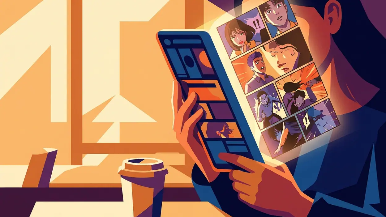
Once an episode opens, WEBTOON’s interaction design settles into its clearest rhythm. The tall, vertically arranged artwork turns the screen into a scrollable page. A thumb movement advances the story in small, controllable increments; there is no need to pinch, turn pages, or repeatedly hunt for a next button. Panels arrive at the pace the reader sets, and the app keeps its interface quiet enough that the art carries the scene.
That quietness is excellent feedback in its own way. Scrolling produces immediate visual progress, so the reader does not need a separate indicator to know that the gesture worked. Episode boundaries bring the interface back into view and make the next action legible: continue, return to the series, or react to what you have just read. The pause is brief, but useful. It turns a long strip into a sequence with natural stopping points.
Actions outside the reading flow are less elegant. Subscribing, liking, commenting, and interacting with episode-access options each have different consequences, and the app does not always make those consequences equally prominent before the tap. The feedback afterward is usually visible, but a clear confirmation cannot fully substitute for a clear explanation in advance. WEBTOON knows how to show that something happened; it could do more to make the choice feel informed before it happens.
Friction and recovery: when the next episode is not simple
Serialized reading creates a particular expectation: finish one episode, then find the next. WEBTOON generally makes that loop easy to follow, but the path can become less straightforward when access rules or episode availability interrupt it. A reader may move from the final panel to a prompt or episode list and need to work out whether to wait, use an available access option, or leave the story for later. The app presents the mechanics in context, yet the interruption still changes the emotional pace. A cliffhanger is designed to pull you forward; a confusing access decision can pull you out of the fiction.
Recovery is better when you have already established a habit. Returning through a saved series or reading history gives the app a useful memory of your intentions, and the episode list offers a clear fallback if you lose your place. Those paths matter more than they might in a self-contained comic: a reader may come back after a day, a week, or a much longer gap and need to re-enter a story without searching from scratch.
There is room to make that recovery feel more reassuring. On a crowded home feed, a series you paused can compete with new recommendations, and the interface’s emphasis on fresh discovery can make continuation feel like just another option. A stronger visual distinction between “continue reading” and “try something new” would respect the reader’s existing commitment. WEBTOON is good at creating the next impulse; it could be more deliberate about preserving the previous one.
Consistency across the experience
The app is most consistent in its visual language: cover-led cards invite browsing, series pages gather context, and episodes strip the chrome back so the comic takes over. That is a coherent progression from choice to commitment to immersion. It also means the product’s core promise remains recognizable as you move between very different kinds of stories.
Consistency is less complete in the way information is prioritized. A title may be easy to recognize but harder to assess quickly; the prominence of descriptions, update cues, and access details varies by where you encounter it. The same reader can feel guided on a series page and left to infer things from a card in the feed. This is not a failure of visual polish so much as a hierarchy problem: the app’s most reliable design system is for presenting comics, not for answering every practical question around them.
Compared with an audiobook service such as Audible, where playback controls and listening state have to remain visible across many contexts, WEBTOON has a simpler central task: help the reader find a story and keep moving through it. Its relative simplicity should make the experience feel lighter, and often it does. But the comparison also clarifies what WEBTOON leaves implicit. Reading progress and a clear route back are not background conveniences; they are part of the navigation system for serialized work.
Small-screen decisions: a format that earns the scroll
WEBTOON’s vertical format is not merely a workaround for reading on a phone. It gives artists room to control spacing, pauses, reveals, and the timing between panels. A long drop through empty space can hold a beat; a sudden close-up can land harder because the reader has moved into it. On a small screen, the scroll becomes both navigation and pacing, and the interface does not ask the reader to divide attention between a page-turn gesture and the story.
The trade-off is that screen height and thumb reach shape the experience more than they would in a conventional page layout. A long episode asks for repeated gestures, and accidental fast scrolling can carry you past a panel before you have properly read it. The forgiving move is to slow down and scroll in shorter strokes, but the app’s basic design cannot remove the physical limits of a small display. Nor should it try too hard: adding persistent controls over the artwork would solve one problem by cluttering the format that makes WEBTOON distinctive.
Orientation and one-handed use therefore work best when the app gets out of the way. The reader can settle into a comfortable grip and advance at a personal pace without negotiating a row of buttons. That restraint is a practical design choice, not just a visual one, and it explains why the reading view feels more finished than the browse view.
What experienced readers notice
Regular readers learn the app’s rhythms. They know when to return to a series page, where to look for the next episode, and which parts of the interface are discovery surfaces rather than personal shelves. With that familiarity, the feed becomes less of a maze and more of a source of occasional surprises. A reader who follows several ongoing series can move between familiar stories and new ones without needing to rebuild the habit each time.
Expert use also reveals the cost of a recommendation-first home. The more established your reading list becomes, the more valuable it is to see your own priorities before the app’s suggestions. Saved titles, recent activity, and upcoming episodes are not merely account features; they are the reader’s working dashboard. WEBTOON has the ingredients for that continuity, but its most prominent surfaces still lean toward what to start rather than what you have already chosen to follow.
This makes the app feel welcoming to a casual browser and slightly less tailored to a committed reader. The gap is not dramatic, because series pages and history provide practical recovery routes. It is a matter of emphasis. The design understands that serialized comics can become a routine, but it could put that routine closer to the front door.
The strongest design choice
The best decision is the separation between the discovery interface and the reading surface. WEBTOON can surround a story with recommendations, social cues, and series information when you are choosing, then largely withdraw when you begin. That shift protects the comic’s pacing. It also gives the product a compelling behavioral loop: browse until a cover catches your eye, sample an episode, follow a series, and return when the next installment appears.
That loop is why the app can become part of a daily routine rather than a place someone visits only when they remember to look for comics. The reader does not have to construct a complicated session. A few scrolls can reveal a new title; one tap can bring an existing story back into reach. WEBTOON’s strongest design is not a clever control but an understanding of how little the reader wants to do between wanting a story and reading it.
There is a risk in making the loop so easy: the catalog can start to feel like an endless stream of prompts. The answer is not more decoration or more interruptions. It is sharper hierarchy, especially around the reader’s own saved and ongoing stories, and clearer explanations at the points where access choices affect momentum.
My verdict is that WEBTOON has a notably confident mobile reader wrapped in a less disciplined discovery experience. Its vertical scroll turns the phone into a natural comic-reading surface, and its episode structure makes returning to a series feel habitual rather than burdensome. Finding a new story is attractive but sometimes noisy; understanding access and protecting an established reading routine could be clearer. The product’s defining strength is the calm it gives the artwork. If its browsing and recovery paths learned to be as considerate as the reading view, the whole app would feel as carefully composed as the comics it carries.