Parchisi STAR Online Gets the Board Right, but the Menus Need Work

Parchisi STAR Online understands the pleasure of a board game better than it understands the journey around one. The match itself is legible, tactile, and brisk: dice roll, tokens move, rivals close in, and a safe arrival can flip the mood of the table. Getting from the lobby into that satisfying rhythm is less assured. The visual noise and uneven feedback make the design feel strongest at the center of play, then less considered whenever a player needs to choose, wait, or recover.
That imbalance matters because this is a game built for short visits. A round of Parchisi can fill a few spare minutes, but only if the interface helps players grasp the stakes without demanding a second game of menu-reading. The core has a clean hook and a natural replay loop; the surrounding experience sometimes obscures both.

Parchisi STAR Online
Gameberry Labs4.7Board
See More Apps Related to Parchisi STAR Online


Where the game’s design works, and where it slips
First-use orientation: the board explains the game
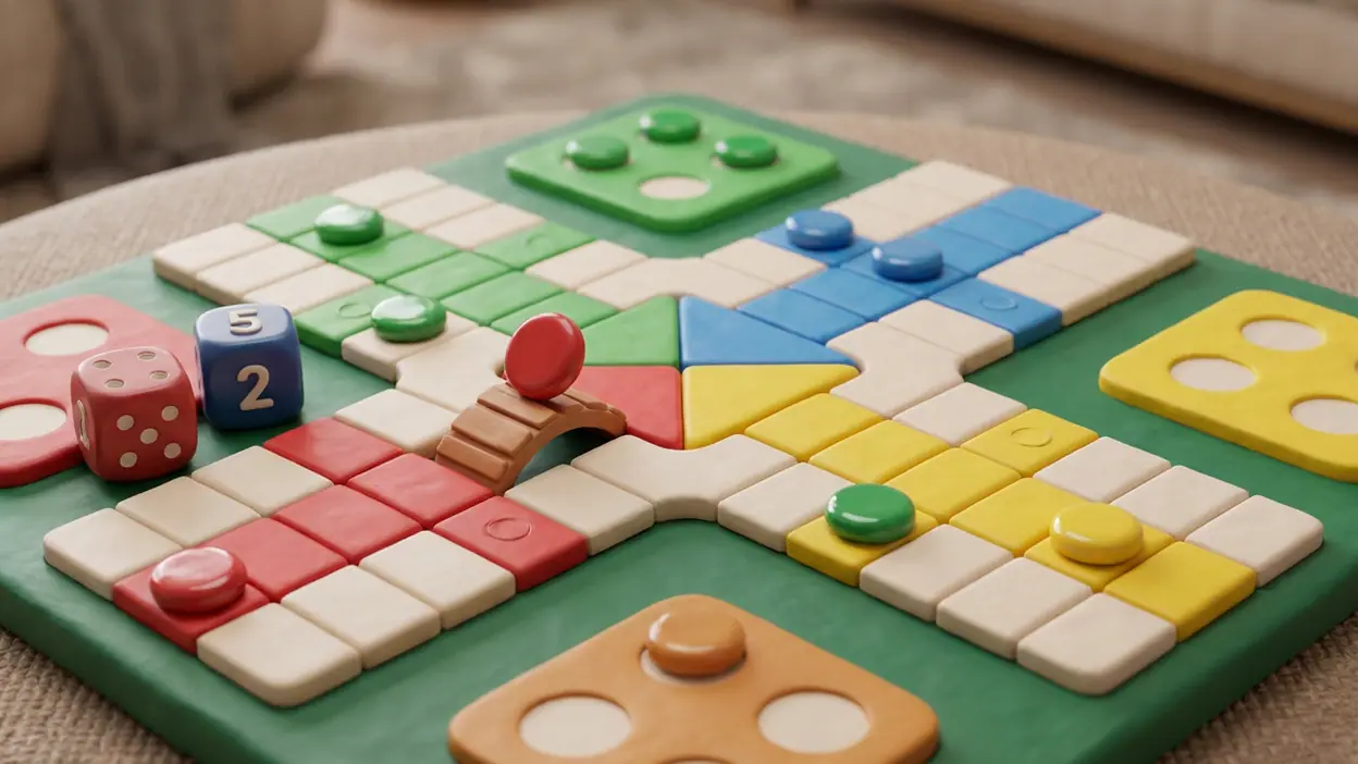
The first useful moment arrives once a match begins. The colored paths and home areas make the objective immediately recognizable, even to someone who has not played this particular mobile version. Tokens have distinct colors and positions, and the dice are the obvious next point of attention. The board does much of the teaching without interrupting play with a long tutorial. That is good interaction design: the important information sits where the decision happens.
But the lobby asks for more interpretation than the board. New players encounter several modes, currencies, rewards, and entry choices before they have built a mental model of what a typical match feels like. Those elements may be familiar to returning players, yet a newcomer has little help separating the essential choice, which is simply how to play, from the surrounding progression and promotion. A clearer first-use route would introduce one straightforward match first, then reveal the extras when they become relevant.
Once seated, the game’s central rhythm is easy to read. A dice result sets a constraint, the available token choices create a small tactical puzzle, and movement makes the consequence visible. The loop has a pleasant pulse: wait for a useful roll, decide whether to advance or protect a position, then watch the board change. Even a short turn can feel consequential because opponents are advancing at the same time.
Navigation and hierarchy: too much shares the spotlight
The interface’s main hierarchy problem is not that it lacks destinations; it is that too many destinations compete for attention. The lobby mixes match access with reward-oriented material and other invitations, so the eye must sort through a busy screen before reaching the simple action that brought it there. The game’s cheerful palette suits a social board game, but bright colors alone cannot establish priority. When every card or button seems eager to be tapped, the next step becomes less obvious.
In a match, the hierarchy improves. The board occupies the visual center, and the active turn gives the player a clear reason to look at the dice and tokens. This contrast is revealing: Parchisi STAR Online has a stronger sense of composition when there is a shared physical space to organize around. Outside that space, navigation feels more like a collection of competing panels than a guided path.
Worth Reading Next

Why WhatsApp Messenger Is Your Go-To Communication App

Tile Club - Match Puzzle Game: A Fresh Spin on Classic Challenges

How Waze Transforms Navigation with Big Tech Power

Mastering Google Sheets: Unlock Hidden Features for Power Users

How Uber's Ride Request App Transformed Urban Mobility
More From Our News Desk
View All


That makes returning to a match or starting another one more important than it might sound. A good board-game app should let the table remain the main event, not make players negotiate an elaborate foyer between rounds. The quickest route back to play should be unmistakable, with secondary goals kept in a quieter visual register.
Feedback after actions: satisfying movement, thin explanation
The best feedback comes from the tokens themselves. A move changes the board in a way that is easy to follow, and the result is visible to everyone at the table. The game’s basic action-and-consequence chain needs little translation: roll, move, see whether a token has advanced safely or come under threat. That immediacy gives the round its social energy. A lucky roll is not just a number; it is a change in the position everyone can see.
Where feedback is less effective is in the space between action and understanding. In a turn-based game, a pause can mean several things: another player is deciding, a connection has stalled, or the game is waiting for an action. If those states do not feel distinct, a player may wonder whether to wait or intervene. Clear, persistent status cues matter here more than elaborate animation. The board should communicate whose turn it is and whether the game is progressing without forcing players to infer it from a brief flourish.
The same principle applies to rewards and results. A post-match screen should make the outcome, the reason for any change in progress, and the next sensible action easy to distinguish. When rewards and calls to continue compete for the same attention, the emotional landing of a match becomes muddled. Parchisi is strongest when feedback reinforces the board’s story, rather than adding a second layer of visual business after the final move.
Friction and recovery: waiting should not feel like guessing
Online play introduces interruptions that a physical board does not: an opponent may take time, a connection can wobble, or a player may leave a match. The design has to make those disruptions understandable and give people a credible route forward. In those moments, a clear waiting state and an explicit explanation are more useful than a decorative animation. Players should be able to tell whether the match is paused, whether they can still act, and what happens if the interruption continues.
Recovery also means helping a player return after a mistaken tap or an unexpected result. On a crowded screen, a prominent button can be easy to hit before its consequence is clear. The game benefits when important decisions are reversible where possible, and when irreversible ones receive a brief, plain confirmation. This is especially valuable for people playing casually, who may be splitting attention between the game and the room around them.
There is a broader design lesson here: the game’s core action is forgivingly familiar, but the social layer is not. A player can understand how to move a token and still be unsure what a stalled turn means. Better recovery would make the online setting feel less fragile without slowing down the quick matches that give the game its appeal.
Consistency across the experience: one mood, several rhythms
The playful visual identity is a useful thread between lobby and match. Bright colors and rounded presentation signal that this is a casual game, not a sober strategy simulator. Yet consistency is more than using the same palette. It also means that controls, labels, and feedback behave predictably as players move between the lobby, a live table, and the result screen.
The board benefits from stable rules and a clear spatial logic: colors retain meaning, tokens stay tied to their routes, and the state of the match can be read at a glance. Menus have a different rhythm, driven by browsing and choosing. Those two modes can coexist, but the change should feel deliberate. A more restrained lobby hierarchy and consistent placement for core actions would make the whole experience feel like one product rather than a lively board attached to a busier reward hub.
That distinction is worth emphasizing because the game is not asking for a complicated interface. Its rules carry most of the complexity. The surrounding screens should reduce mental effort, not add another layer of decisions before players can roll.
Small-screen decisions: the board earns its space
On a phone, the board has a natural advantage: its geometry is compact enough to make the route visible without zooming or panning. The path, home areas, and token positions can be understood together, which is exactly what a turn-based race game needs. Keeping the active play space central is the right small-screen decision, because it lets players compare their position with rivals without repeatedly shifting attention between separate views.
The cost is that secondary information has little room to breathe. Buttons, player details, and prompts must coexist around the board, and any extra decoration can make the screen feel crowded. The best mobile layout is not the one that fits the most information at once; it is the one that keeps the current decision clear. Parchisi STAR Online generally benefits from letting the board dominate, but its surrounding interface would gain from tighter editing and more deliberate emphasis.
Touch interaction also changes the feel of a move. A token should be easy to select without obscuring the path or confusing nearby options. Clear selection feedback is crucial when several tokens share the same color and may be eligible to move. The board communicates its broad state well; the finer interaction details matter most when a player is choosing between plausible moves under pressure.
What experienced players notice
After a few rounds, the obvious questions give way to small tests of the design. Can I recognize a safe route quickly? Can I tell which token is in danger without scanning every corner? Does the game make the active player and the available choices obvious when the turn changes? These are not glamorous features, but they determine whether the game supports quick tactical thinking or repeatedly interrupts it.
The strongest expert-facing quality is the board’s readable spatial language. Experienced players can focus on risk, timing, and the relative position of several tokens rather than decoding the interface. The weaker point is the time around those decisions: lobby browsing and post-match prompts can interrupt the mental thread between games. People who play often benefit most from a clean repeat path, because even minor friction compounds across many short sessions.
That is also where replay value comes from. Parchisi’s rules are simple enough to invite another round, but opponent behavior and dice outcomes keep each match from feeling entirely scripted. A close race can turn on one move, and the social presence of other players makes waiting and reacting part of the drama. The design does not need to manufacture complexity; it needs to protect that quick, unpredictable exchange.
The strongest design choice
The game’s best decision is letting the board do the explaining. Rather than burying the central activity beneath elaborate mechanics, it puts the colorful race path at the heart of the screen and makes movement the main event. A useful roll immediately becomes a visible opportunity; a threatened token gives a turn tension. That connection between action and consequence is the reason the game remains easy to return to.
It is a stronger choice than any single flourish because it supports both newcomers and regulars. A first-time player can follow the movement, while a practiced one can read the same board tactically. The design has found the right center. Its job now is to make every surrounding screen serve that center with equal discipline.
Final design verdict
Parchisi STAR Online is a compelling mobile board game with a strong on-board interaction model and a less polished supporting experience. Its hook is immediate, its turn rhythm is satisfying, and its replay value comes naturally from the changing fortunes of a shared race. The board stays readable on a small screen and gives each move a visible consequence, which is the hard part of adapting a familiar tabletop game for touch.
The weakness is the gap between that clarity and the busier interface around it. First-use choices could be better staged, the lobby needs a firmer hierarchy, and online pauses deserve clearer feedback and recovery paths. These are not reasons to dismiss the game; they are the design issues that keep a good match from becoming a consistently smooth visit. The verdict is clear: the table is worth sitting down at, and a more focused journey to and from it would make the whole experience feel as confident as the game it contains.