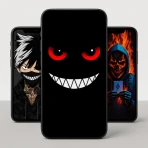
Raven Dark Icon Pack
For Android
Changing the look of an Android phone can feel more complicated than it should. I usually want a cleaner home screen, not a long customization project, and that is where Raven Dark Icon Pack makes a useful first impression. It is a paid personalization app from Creativepixels, built around a darker visual style for supported app icons. The idea is simple: install it, connect it with a compatible launcher, and give the home screen a more consistent night-time appearance.
That simplicity is important for first-time users. This is not a replacement launcher, a wallpaper service, or a complete phone makeover by itself. It is an icon pack, so its success depends partly on the launcher you already use and on how many of your installed apps are recognized. I found it most appealing when I wanted to reduce the bright mixture of default icons without rebuilding every screen from scratch.
The app is listed for Everyone and works with Android versions starting at 5.0. It costs $0.69, which places it in the inexpensive paid-customization category rather than the subscription-heavy side of personalization. Its current version is 1.3.0. With an average rating of 4.5 from around 370 ratings and more than 10K installs, it has attracted a modest but positive audience. Those figures do not replace personal testing, but they suggest that the basic concept is landing well with people who want a darker home-screen treatment.
What the dark style changes on a real home screen
The main benefit is visual consistency. Default Android icons often come from different design systems: some are colorful, some are flat, some use gradients, and others have nearly no visual relationship to one another. A dark icon pack can make that collection feel calmer, especially on a dark wallpaper or an OLED display where black areas blend into the background.
I would describe the look as better suited to people who prefer subdued contrast over bright, attention-grabbing colors. It works particularly well on a phone used at night, during reading, or in a low-light room. The darker treatment can also make a busy home screen feel less visually noisy, although it does not automatically improve organization. If your apps are scattered across several pages, the pack changes their appearance but not your habits.
One practical point is easy to overlook: an icon pack is not the same as a system-wide dark mode. Menus, widgets, notification panels, and individual apps keep their own designs. Raven Dark Icon Pack changes the icons that your launcher allows it to change. That means the result can be attractive without being perfectly uniform. A few untouched icons beside the dark ones may stand out, particularly on the first page of your home screen.
That mixed result is not necessarily a failure. I actually prefer using the pack selectively rather than expecting every icon to match. For example, I can keep the most-used applications on the first page, apply the dark style there, and leave less important shortcuts on another page. This creates a deliberate visual hierarchy instead of making the entire phone look like one undifferentiated block.
Who will get the most from it
This app is a strong fit for someone who already has a launcher with icon-pack support and wants a low-cost visual refresh. It also suits users who have tried changing individual icons and found the process too slow. Applying a coordinated pack is usually more practical than searching for a separate image for every application.
I would also recommend it to people who use a dark wallpaper and want the icons to stop competing with it. A night-sky photograph, a black gradient, or a simple charcoal background gives the pack room to work. On a very bright or colorful wallpaper, the darker icons may look less integrated, so the choice of background matters more than a new user might expect.
It is less suitable if you want a complete launcher experience with custom gestures, app-drawer redesign, widgets, or extensive layout controls. Those are launcher functions, not icon-pack functions. It is also not the right choice if you need every obscure application to have a matching icon. In that situation, a larger or more frequently updated icon collection may be a better fit, provided it supports your launcher.
Getting through the first setup without confusion
The first meaningful step is not simply opening the app. It is checking whether the launcher on your phone can use third-party icon packs. This is the most important expectation to set before paying for any icon-focused personalization app. Many popular Android launchers include an appearance or icon section, while some manufacturer launchers offer more limited customization.
After installing Raven Dark Icon Pack, I would begin by opening it and looking for its available apply or launcher-related controls. If the app presents a launcher choice, select the one you actually use for your home screen. If it sends you to launcher settings instead, open the appearance area and look for an icon-pack option. The wording can vary between launchers, but the general path is usually home-screen settings, theme or appearance, then icons.
You may also like

Amazon Kindle: Revolutionizing Digital Reading

Why OLX: Compras Online e Vendas Captivates Shoppers Worldwide
Unpacking the Strategy of Yalla Ludo's Jackaroo Mode

Why eBay's Mobile App Stands Out in Online Shopping

How Fishdom's Puzzle Mechanics Transform Your Aquarium Experience

Block Blast! The Perfect Puzzle for Busy Lives
The reassuring part is that this process does not require replacing the launcher. If your current launcher supports the pack, you can keep your existing pages, folders, and general layout while changing the icon appearance. That makes the experiment reversible and keeps the first attempt low risk. I would take a moment to remember how to return to the default icon style before applying anything, especially if you are new to launcher customization.
There is also a useful workflow for avoiding a disappointing first result. Before changing the whole phone, apply the pack and inspect the home screen page you use most. Look at familiar icons, folders, and any shortcuts that matter to your daily routine. If the visual balance feels right there, continue to other pages. If it feels uneven, you have learned that early rather than discovering it after reorganizing everything.
The first successful action
For a first-time user, success should mean seeing a recognizable improvement on one screen, not completing every possible customization task. I would start with the main home page, apply the pack through the launcher, and then pause. Check whether the icons are easier to scan against your wallpaper and whether the darker palette feels comfortable in the lighting where you normally use the phone.
A realistic example is an evening routine. I might place messaging, calendar, music, reading, and browser shortcuts on the first page, switch to a dark wallpaper, and apply the pack. When I pick up the phone later, the screen feels less bright and less visually fragmented. That is a small change, but it is a meaningful one because it affects the screen I actually see dozens of times a day.
Folders deserve special attention during this first test. A folder can contain a mixture of themed and untouched icons, and the small size makes differences harder to notice. If one important application remains bright, I would move it to a secondary position or use the launcher’s individual icon-editing option if available. This is one of the practical trade-offs of icon packs: the overall style can be strong even when coverage is not perfect.
Another useful tip is to judge the pack with your normal icon size, not an unusually enlarged preview. Larger icons can make details look impressive, but the real test is how clearly the symbols read at the size you use every day. If the icons become harder to identify, the darker appearance may not be worth the extra visual uniformity. Personal recognition should come before aesthetics.
Where first-time users commonly get stuck
The most common confusion is expecting the app to change icons immediately after installation. An icon pack normally needs a compatible launcher to apply it. If nothing changes, that does not automatically mean the pack is broken. First check the launcher’s own appearance settings, then confirm that the pack was selected there. If your launcher has no icon-pack option, the limitation is likely the launcher rather than the dark design itself.
A second point of confusion is partial coverage. New users may assume that every installed app will receive a matching icon. In practice, an icon pack can leave some applications unchanged, particularly less common apps or newly installed ones. The result may therefore contain a few original icons. I see this as a reason to preview your most important pages, not as a reason to judge the entire pack from one unfamiliar shortcut.
There can also be a difference between an app’s own preview and the final home-screen result. The launcher controls icon size, spacing, labels, folder presentation, and sometimes masking. A design that looks balanced in the pack’s interface may appear tighter or more spread out after application. Adjusting the launcher’s icon scale or grid can help, but I would change one setting at a time so you know what improved the result.
Widgets create another visual mismatch that is easy to blame on the icon pack. A bright weather widget, colorful calendar widget, or vivid search bar can dominate the screen even when the icons are dark. If the goal is a coherent night-time layout, I would first reduce competing elements: use a quieter wallpaper, remove unnecessary widgets, or place colorful information on another page. The pack can support a dark setup, but it cannot recolor unrelated components.
Finally, remember that changing the icon pack does not reorganize your applications. If you want faster access, combine the visual change with a small layout decision: keep daily tools on the first page, group occasional tools in folders, and move rarely used shortcuts away from the main view. That is where the pack becomes more than decoration. It can make a simple arrangement feel intentional, but the arrangement still has to come from you.
How it compares with the usual personalization choices
Compared with changing icons one by one, Raven Dark Icon Pack is much faster when your launcher supports it. Individual editing gives you maximum control, but it also creates a maintenance problem: every new application requires another decision, and matching styles across dozens of icons takes patience. A pack offers a ready-made direction, which is valuable when you want a consistent first result rather than a long creative project.
Compared with a complete launcher, this app is narrower but less disruptive. A launcher can change the app drawer, gestures, grid, folders, and other parts of navigation. That flexibility is useful for someone who wants to redesign how the phone works. On the other hand, replacing a launcher can require learning new controls and rebuilding familiar habits. An icon pack is the better first step if your current launcher already feels comfortable and the visual issue is the main problem.
Compared with a full theme supplied by a phone manufacturer, an icon pack can be more focused. Manufacturer themes may alter menus, lock screens, wallpapers, and system accents, but they can also introduce more changes than you wanted. Raven Dark Icon Pack makes sense when you want to keep the rest of the interface familiar. The trade-off is that it cannot promise the same system-wide consistency as a complete theme.
Price also affects the comparison. At $0.69, this is a small one-time purchase rather than an ongoing commitment, but it is still worth checking launcher compatibility first. A cheap app is not good value if your home-screen software cannot apply it. I would treat compatibility as the deciding question, not the low cost.
Small decisions that improve the result
I found three choices especially useful. First, pair the icons with a restrained wallpaper instead of a highly detailed image. Dark icons need enough separation to remain readable, but they look less convincing when the background is brighter than the icons themselves. Second, apply the style to the pages you actually use before touching secondary pages. This reveals whether the design works with your real app mix.
Third, keep one familiar arrangement while testing. It is tempting to change the wallpaper, grid, widgets, folders, and icon size all at once. That makes it difficult to tell whether you like the pack or merely like the novelty of a completely different screen. A controlled first test gives a clearer answer and makes it easier to undo the parts you do not enjoy.
I would also leave room for exceptions. If one frequently used app remains unthemed, keeping it visible may be better than hiding it in the name of symmetry. Recognition speed matters more than perfect color matching, especially for banking, work, navigation, or communication tools that you open quickly. A good personalized screen should feel easier to use, not like a design display that slows you down.
What to do after the first successful screen
Once the main page feels comfortable, extend the style gradually. Move to a second page or a small folder and see whether the same visual balance holds. This is also the point to decide whether you want a minimalist layout or a fuller one. The pack can support either approach, but fewer icons usually make the dark treatment more noticeable.
If you install new applications later, check the home screen rather than assuming the visual style will remain complete. A newly added shortcut may use its original icon, creating an unexpected bright spot. That is normal for a growing app library. You can decide whether to leave it as an accent, move it off the main page, or adjust it individually through your launcher if that option exists.
It is worth keeping the app installed if you expect to change launchers or layouts again, because the pack can remain part of your personalization setup. Still, the most important test is long-term comfort. After the novelty fades, ask whether you can identify your common apps quickly and whether the darker appearance still looks good in daylight as well as at night. If the answer is yes, the purchase has done its job.
Creativepixels has kept the concept focused, and that focus is both the appeal and the limitation. You get a straightforward route toward a darker icon style, but not a complete answer for every part of the Android interface. Users who want broad theme controls should look toward a launcher or system theme instead. Users who already like their launcher and only want calmer icons have a more suitable reason to choose this app.
My final recommendation is therefore conditional but positive. If your launcher supports icon packs, you like dark home screens, and you are comfortable with a few icons potentially remaining outside the style, Raven Dark Icon Pack is an inexpensive way to make the first page feel more deliberate. Start with one screen, use a quiet wallpaper, and judge readability at your normal icon size. The best first result is not a perfectly themed phone; it is a home screen that feels calmer while staying easy to use.
Pros
- Dark
- moody icons give compatible home screens a distinctive look.
- Large icon selection covers many popular Android apps.
- Includes alternative icon styles for extra customization.
- Matching wallpapers help create a cohesive dark theme.
- Icons remain clear and recognizable at smaller sizes.
Cons
- Requires a compatible launcher for full icon replacement.
- Some less-known apps may not have custom icons.
- Updates may be infrequent for newly released apps.
- Certain features may require an in-app purchase.
- Not suitable for users who prefer colorful or bright themes.
FAQ
What is Raven Dark Icon Pack?
Raven Dark Icon Pack is a third-party customization app designed to replace the default icons on compatible Android devices. It features a dark, modern visual style with carefully designed icons intended to give your home screen a more consistent appearance. The pack may also include wallpapers, alternative icon styles, and an icon request tool for apps that are not currently supported.
Which Android launchers are compatible with Raven Dark Icon Pack?
Compatibility depends on the launcher installed on your phone. Raven Dark Icon Pack generally works with many popular third-party launchers, such as Nova Launcher, Lawnchair, Smart Launcher, Apex Launcher, Action Launcher, and similar options that support custom icon packs. Some manufacturer launchers may not accept third-party icons, so you should check the app’s compatibility list before downloading.
Does Raven Dark Icon Pack include icons for every app?
No icon pack can realistically include a custom icon for every application, especially when new apps are released frequently. Raven Dark Icon Pack usually covers a large selection of popular apps, but unsupported icons may remain unchanged or use an automatically shaped alternative. If available, the built-in icon request feature can help you ask the developer to add missing applications in a future update.
How do I apply Raven Dark Icon Pack to my home screen?
After installing the pack, open it and look for the apply option, then select a compatible launcher from the list. You can also open your launcher’s settings, find the icon or appearance section, and choose Raven Dark Icon Pack manually. The exact steps vary between launchers, and some may require you to apply icons individually when automatic application is unavailable.
Is Raven Dark Icon Pack free to use, and does it affect phone performance?
The availability of free features, premium content, and advertising can vary depending on the version distributed through the app store. Applying an icon pack normally has little effect on performance because it mainly changes visual assets, although launchers may use additional storage for cached icons. Phones with limited storage or older hardware should still work normally, provided the launcher itself runs smoothly.